NASA Satellite Images 2025: The Truth About Melting Ice, Rising Seas & a Warmer Planet
Ever scrolled through your feed and stumbled on a viral video of a massive iceberg calving off Antarctica, or read about coastal towns prepping for floods that seem to hit harder every year? In 2025, with climate summits like COP30 dominating headlines and extreme weather events—from California's wildfires to Europe's flash floods—becoming the new normal, NASA's satellite images are dropping truth bombs that hit close to home. These aren't just pretty pictures from space; they're stark visuals showing our planet heating up faster than ever, with ice melting at alarming rates and seas creeping higher. As urban heat islands bake cities and migration from low-lying areas spikes amid rising insurance costs, NASA's data ties it all together, revealing a warmer world that's not some distant future—it's now. Think about it: The Arctic sea ice hit one of its lowest extents this year, and Antarctic shelves are crumbling, all captured in high-res from satellites like Landsat or GRACE-FO. I've pored over these images myself, feeling that mix of awe and urgency, like when you see Greenland's glaciers retreating in time-lapse. It's not scare tactics; it's science calling for action. In this post, we'll dive into what NASA's 2025 satellite images reveal about melting ice, rising seas, and a hotter planet, backed by the latest data. We'll break down the visuals, the science, and what it means for us all. If you're worried about your beach vacation spot disappearing or just curious about Earth's changes, stick around—this could change how you see our world.
Melting Ice Caps: Shocking Visuals from NASA's Satellites
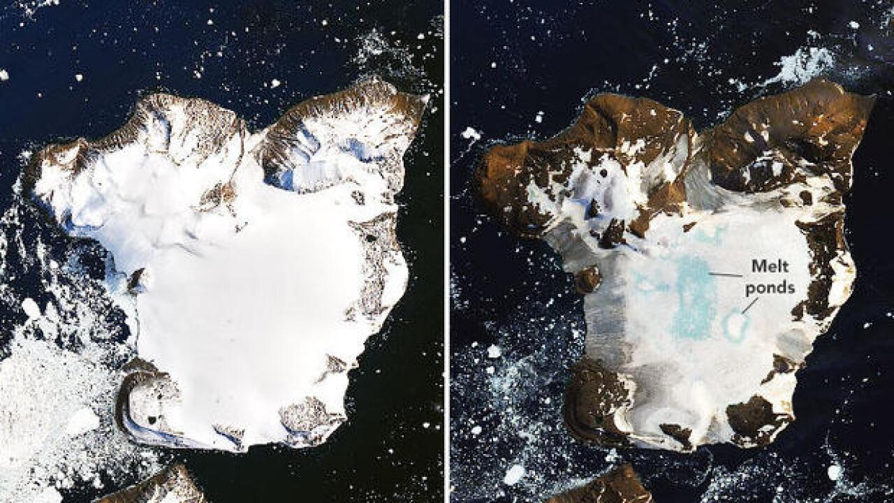
NASA's satellites have been our eyes in the sky for decades, and in 2025, they're showing ice melt on steroids. The World of Change series from NASA Earth Observatory uses Landsat imagery to track Antarctic sea ice, revealing it hit an all-time low this year, expanding less in winter and melting more in summer. Arctic sea ice reached its annual minimum in September 2025, tying for the sixth-lowest on record, as seen in daily images from NASA's Moderate Resolution Imaging Spectroradiometer (MODIS). These visuals aren't abstract—they show vast blue expanses where white ice once dominated, signaling trouble for polar ecosystems and global weather.
Greenland and Antarctica are losing ice mass at rates unseen before, with GRACE-FO satellites measuring gravity changes to quantify melt. In 2025, Antarctica's sea ice decline was the third-lowest maximum on record, as captured in new images highlighting the vulnerability of shelves like Thwaites Glacier. Warmer ocean waters are eating away from below, creating vortices that accelerate melting, per NASA's latest models.
Key Insights from 2025 Ice Melt Images
NASA's data paints a clear picture of acceleration:
- Antarctic Lows: Sea ice extent hit third-lowest maximum, with images showing open water where ice should be.
- Arctic Minimums: Tied for sixth-lowest, with MODIS visuals revealing more dark ocean absorbing heat.
- Glacier Retreat: Landsat time-lapses show Greenland's ice sheets shrinking, contributing to sea rise.
- Ocean Vortices: New models illustrate underwater melting, invisible but devastating.
- Historical Comparisons: World of Change series contrasts 2025 with past years, showing consistent decline.
- Polar Bears' Plight: Images capture shrinking habitats, tying melt to biodiversity loss.
- Feedback Loops: Less ice means less reflection, warming seas further in a vicious cycle.
These images aren't just pretty—they're warnings of tipping points ahead.
Rising Seas: NASA's Alarming 2025 Data
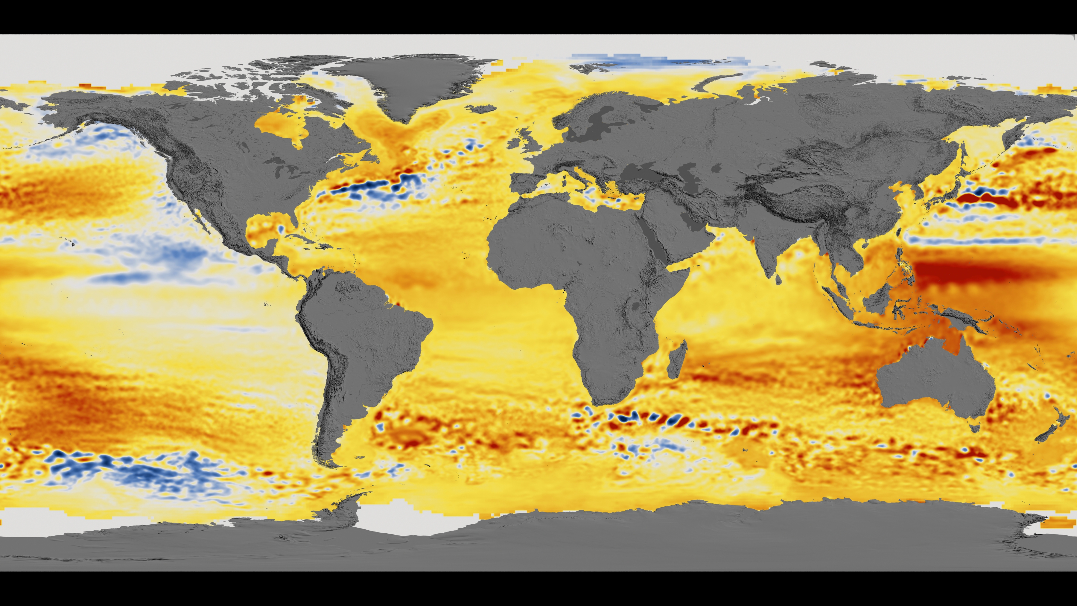
Sea levels aren't rising—they're accelerating, per NASA's 2025 analysis. Satellites like Jason-3 and Sentinel-6 show a global rise of 3.4 mm per year, but 2024 data (carrying into 2025) revealed an unexpected surge, adding 0.76 cm extra due to El Niño and ice melt. Images from the Sea Level Change Portal depict coastal encroachments, with places like the Maldives or Miami facing submersion risks.
Antarctic meltwater not only raises seas but delays some warming by cooling oceans, yet models predict 0.3-2 meters rise by 2100 if unchecked. NASA's new maps show uneven rise—higher in the Pacific due to gravity shifts from lost ice mass. This isn't distant; 2025 storms like Hurricane Ian's remnants showed how higher bases amplify flooding.
Visual Evidence of Sea Level Threats
Satellite imagery tells the story:
- Global Rise Maps: Jason series shows 10 cm rise since 1993, accelerating in 2025.
- Coastal Erosion: Landsat captures vanishing beaches in the US and Asia.
- Island Submersion: Pacific atolls shrinking, as seen in high-res images.
- Storm Surge Amplification: Higher seas mean deadlier hurricanes, per 2025 data.
- Uneven Distribution: Gravity models illustrate why some areas rise faster.
- Flood Risk Projections: Interactive tools show future inundation for cities like New York.
- Meltwater Effects: Images link Antarctic loss to global levels.
These visuals make the abstract real, urging coastal planning.
A Warmer Planet: NASA's Temperature and Climate Visuals
NASA's satellites confirm 2025 as one of the hottest years, with GISS data showing global temps 1.2°C above pre-industrial averages. Images from MODIS reveal heat anomalies, like red-hot swaths over Europe and the US during summer waves.
Ocean heat content is at record highs, fueling stronger storms and marine heatwaves that bleach corals. Atmospheric CO2 hit 420 ppm, visualized in Mauna Loa graphs, driving the warmth. NASA's Earth Observatory series contrasts 2025 with cooler eras, showing expanded deserts and shifted vegetation.
Striking Images of Warming Effects
- Temperature Anomalies: Maps show red zones over continents, indicating hotter averages.
- Ocean Heatwaves: Satellite views of bleached Great Barrier Reef.
- Drought Patterns: Dried reservoirs in California and Africa.
- Permafrost Thaw: Siberian sinkholes from melting ground.
- Vegetation Shifts: Greener Arctic, browner tropics in time-lapse.
- Extreme Weather Links: Images tie warmth to floods and fires.
- CO2 Plumes: Visuals of emission hotspots from power plants.
These prove warming's fingerprints on daily weather.
Human Causes and the Role of Satellites in Monitoring
Satellites like OCO-2 track CO2 sources, pinning 90 percent of warming on human activities—fossil fuels, deforestation, and agriculture. In 2025, data shows emissions rebounding post-COVID, with China and the US as top contributors. Urban heat islands, visible in thermal images, amplify local warming.
NASA's role is crucial: Satellites provide real-time data for models predicting future extremes, aiding policy like the Paris Agreement. But with space debris and funding cuts, maintaining this eye in the sky is vital.
How Satellites Track Change
- Ice Monitoring: GRACE measures mass loss.
- Sea Level Altimetry: Jason tracks rises millimeter by millimeter.
- Temperature Sensing: MODIS captures global heat patterns.
- Emission Mapping: OCO-2 pinpoints CO2 sources.
- Vegetation Health: Landsat shows drought impacts.
- Storm Tracking: GOES satellites predict hurricanes.
- Data Integration: Combined for climate models.
These tools empower action, from local adaptations to global treaties.
Impacts on Ecosystems, Communities, and Economies
Melting ice disrupts ocean currents, potentially cooling Europe while warming elsewhere. Rising seas threaten 1 billion coastal dwellers by 2050, with 2025 floods in Bangladesh displacing millions. Warmer temps shift diseases, like malaria spreading north, and hurt agriculture, costing $100 billion yearly in losses.
Ecosystems suffer: Coral reefs bleach, forests burn, species migrate or die. Economies face $2 trillion annual hits by 2030 from extremes. Communities, especially in poor nations, bear the brunt, fueling migration and conflict.
Key Consequences
- Biodiversity Loss: 1 million species at risk from habitat changes.
- Human Displacement: 200 million climate migrants by 2050.
- Health Risks: More heat deaths, vector-borne diseases.
- Economic Damage: Trillions in infrastructure and crop losses.
- Food Insecurity: Reduced yields from droughts and floods.
- Water Scarcity: Melting glaciers dry rivers for billions.
- Social Inequality: Poor communities hit hardest.
These ripple effects touch everyone, from farmers to city dwellers.
What We Can Do: Mitigation and Adaptation Strategies
The good news? We can act. Cut emissions through renewables, efficiency, and reforestation to slow warming. Adapt with sea walls, early warnings, and sustainable farming. Personal steps like reducing meat or flying less add up. Policy pushes for carbon pricing and green tech are key. NASA's data guides these efforts, showing where to focus.
Practical Actions for Individuals and Society
- Reduce Emissions: Switch to electric vehicles, solar power.
- Conserve Energy: Insulate homes, use efficient appliances.
- Support Policies: Vote for climate action, join advocacy groups.
- Adapt Locally: Plant trees, prepare emergency kits.
- Educate and Innovate: Spread awareness, invest in green tech.
- Global Cooperation: Back Paris Agreement goals.
- Monitor and Respond: Use NASA tools for local planning.
Every effort counts in bending the curve.
Frequently Asked Questions
Here are quick answers to common queries on NASA's 2025 images.
- What do NASA's images show about ice melt in 2025? Record lows in Antarctic and Arctic sea ice, with visuals of shrinking extents.
- How much have seas risen in 2025? An unexpected 0.76 cm extra in 2024 data, continuing into 2025 trends.
- Is the planet warmer in 2025? Yes, 1.2°C above pre-industrial, with images showing heat anomalies.
- What satellites capture these images? Landsat for ice, Jason for seas, MODIS for temperatures.
- How does melt affect sea levels? Adds water and expands oceans, with uneven rises shown in maps.
- Are humans causing this? 90 percent yes, through emissions tracked by satellites like OCO-2.
- What can I do about it? Reduce carbon footprint, advocate for policies, support green tech.
Act Now for a Cooler Tomorrow
NASA's 2025 images are a call to arms—our planet's changing fast, but we can slow it. Start by cutting emissions or joining a local climate group. Share your thoughts in the comments: What shocks you most about these visuals? For more on climate science, space news, and action tips, subscribe to our blog. Let's protect our home—sign up today!
References
- World of Change: Antarctic Sea Ice - NASA Science - NASA
- Arctic Sea Ice Minimum Extent - Earth Indicator - NASA Science - NASA
- New Satellite Images Show Alarming Decline in Antarctic Sea Ice - Indian Defence Review
- NASA Analysis Shows Unexpected Amount of Sea Level Rise in 2024 - NASA Sea Level Change Portal
- Here's where Antarctica's ice melt would have the biggest impact on rising seas - The Independent
- Nasa data reveals dramatic rise in intensity of weather events - The Guardian


.jpg)


